Dash Calendar Timeline is a Dash component library.
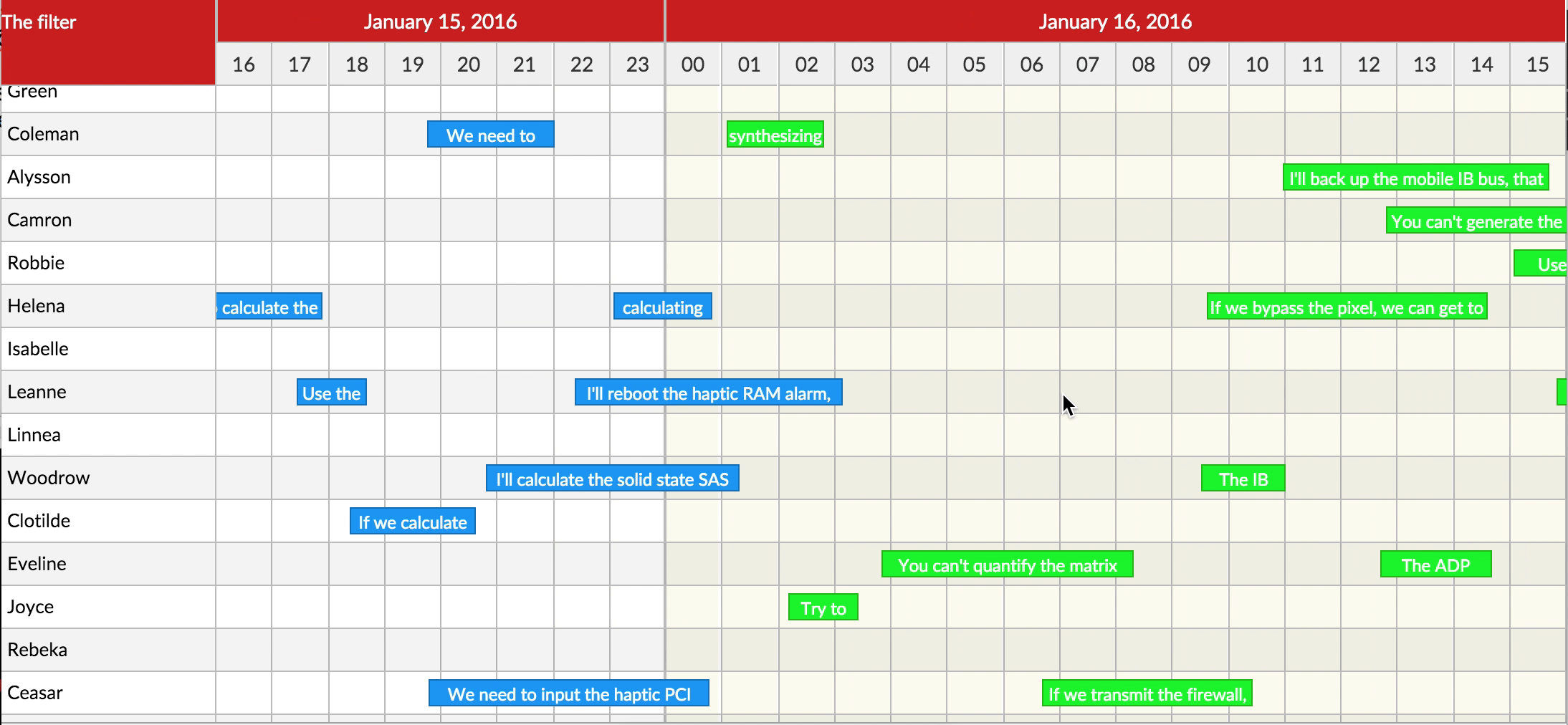
A custom component for rendering (react-calendar-timeline) in Dash Apps.
The ID used to identify this component in Dash callbacks.
Called when the bounds in the calendar's canvas change. Use it for
example to load new data to display. (see \"Behind the scenes\"
below). canvasTimeStart and canvasTimeEnd are unix timestamps in
milliseconds.
a number (default to 3) which represents the extra timeline
rendered on right and lift of the visible area which the user will
scroll through before the time rerenders. Note: setting buffer to
1 will disable the scrolling on the timeline.
Can items be moved between groups? Can be overridden in the items
array. Defaults to True.
Can items be dragged around? Can be overridden in the items array.
Defaults to True.
Can items be resized? Can be overridden in the items array.
Accepted values: False, \"left\", \"right\", \"both\". Defaults to
\"right\". If you pass True, it will be treated as \"right\" to
not break compatibility with versions 0.9 and below.
Called when an empty spot on the canvas was clicked. Get the group
ID and the time as arguments. For example open a \"new item\"
window after this.
Called when the canvas is clicked by the right button of the
mouse. Note: If this property is set the default context menu
doesn't appear.
Called when an empty spot on the canvas was double clicked. Get
the group ID and the time as arguments.
How many pixels we can drag the background for it to be counted as
a click on the background. Default 3.
Use this to render special styles for the cursorMarker.
This will determine whether you'd want to set up custom content
for groups or not.
This will be used to set up custom content of groups in the
sidebar.
This will determine whether you'd want to set up custom content
for items or not.
This will be used to set up custom content of items in the main
timeline.
Marker that is placed on the specified date/time. Example usage:
[
    {'date': 1750070400000, 'style':{'backgorund-color':'red'}},
    {'date': 1750675200000, 'style':{'backgorund-color':'green'}},
    {'date': 1751467500000, 'style':{'backgorund-color':'blue'}}
]
Determines the height of the header in pixels. Default 30.
Controls the how to format the interval label.
Style applied to the root of the header.
Determines the intervals between columns. Values can be second,
minute, hour, day, week, month, year or primaryHeader.
This sets the end time for the timeline.
This sets the start time for the timeline.
Disable the horizontal scroll. Default is False.
This will render a info label over the timeline while the item is
being dragged around.
Style applied to the dragInfoLabel.
Snapping unit when dragging items. Defaults to 15 * 60 * 1000 or
15min. When so, the items will snap to 15min intervals when
dragging.
Item color while the item is being dragged around.
The groups are used to determine the number of groups in a
Timeline.
This will be used to set up custom css classes of content of
groups in the sidebar.
This will be used to set up custom css style of content of groups
in the sidebar.
Called when an item is clicked. Note: the item must be selected
before it's clicked... except if it's a touch event and
itemTouchSendsClick is enabled. time is the time that corresponds
to where you click on the item in the timeline.
Called when the item is clicked by the right button of the mouse.
time is the time that corresponds to where you context click on
the item in the timeline. Note: If this property is set the
default context menu doesn't appear.
Called when an item was double clicked. time is the time that
corresponds to where you double click on the item in the timeline.
Get the dimensions for the currently rendered items.
Warning: Use this prop to render custom items on a fixed timeline only.
Disable horizontal scroll, moving, zooming and resizing as it will
re-render the timeline on every single event for items.
What percentage of the height of the line is taken by the item?
Default 0.65.
This is sent on the first click on an item. time is the time that
corresponds to where you click/select on the item in the timeline.
Normally tapping (touching) an item selects it. If this is set to
True, a tap will have the same effect, as selecting with the first
click and then clicking again to open and send the onItemClick
event. Defaults to False.
The items are used to determine the number of items within a
single group.
This will be used to set up custom css classes for content of
custom items in the main timeline.
This will be used to set up custom css styles for content of
custom items in the main timeline.
Height of one line in the calendar in pixels. Default 30.
Largest time the calendar can zoom to in milliseconds. Default 5 *
365.24 * 86400 * 1000 (5 years).
The minimum width, in pixels, of a timeline entry when it's
possible to resize. If not reached, you must zoom in to resize
more. Default to 20.
Smallest time the calendar can zoom to in milliseconds. Default 60
* 60 * 1000 (1 hour).
Item border (CSS border e.g, 2px solid red) while the item is
being resized.
Width of the right sidebar in pixels. If set to 0, the right
sidebar is not rendered. Defaults to 0.
Item color when item is selected.
Marker that is displayed when hovering over the timeline and
matches where your cursor is.
Marker that is placed on the current date/time.
Renders the Content above the sidebar.
Determines whether the content goes above the left or right
sidebar.
Width of the sidebar in pixels. If set to 0, the sidebar is not
rendered. Defaults to 150.
With what step to display different units. E.g. 15 for minute
means only minutes 0, 15, 30 and 45 will be shown.  Default:
{
  second: 1,
  minute: 1,
  hour: 1,
  day: 1,
  month: 1,
  year: 1
}
Style applied to the root component of headers.
How often the TodayMarker refreshes. Value represents
milliseconds. Default is 10000.
Use this to render special styles for the todayMarker.
Zoom in when scrolling the mouse up/down. Defaults to False.
Append a special .rct-drag-right handle to the elements and only
resize if dragged from there. Defaults to False.
The exact ending viewport of the calendar.
The exact starting viewport of the calendar.
Called when the timeline is zoomed, either via mouse/pinch zoom or
clicking header to change timeline units."""