Update icons to match new VS Code style #1192
Merged
Conversation
This file contains hidden or bidirectional Unicode text that may be interpreted or compiled differently than what appears below. To review, open the file in an editor that reveals hidden Unicode characters.
Learn more about bidirectional Unicode characters
7 tasks
|
Looks good! A few comments:
|

|
@EricJizbaMSFT thanks for the feedback, I went ahead and updated the icons based on your feedback, let me know what you think. Not sure if the new registry icons works. I also left the Error/Warning in their circle/triangle to be consistent with our icons.
|
|
Much better thanks! Although a few of the new ones seem to have a white background problem on light theme... |


|
Sorry about, I removed the white background on all of them.
|
Sign up for free
to subscribe to this conversation on GitHub.
Already have an account?
Sign in.
Add this suggestion to a batch that can be applied as a single commit.
This suggestion is invalid because no changes were made to the code.
Suggestions cannot be applied while the pull request is closed.
Suggestions cannot be applied while viewing a subset of changes.
Only one suggestion per line can be applied in a batch.
Add this suggestion to a batch that can be applied as a single commit.
Applying suggestions on deleted lines is not supported.
You must change the existing code in this line in order to create a valid suggestion.
Outdated suggestions cannot be applied.
This suggestion has been applied or marked resolved.
Suggestions cannot be applied from pending reviews.
Suggestions cannot be applied on multi-line comments.
Suggestions cannot be applied while the pull request is queued to merge.
Suggestion cannot be applied right now. Please check back later.
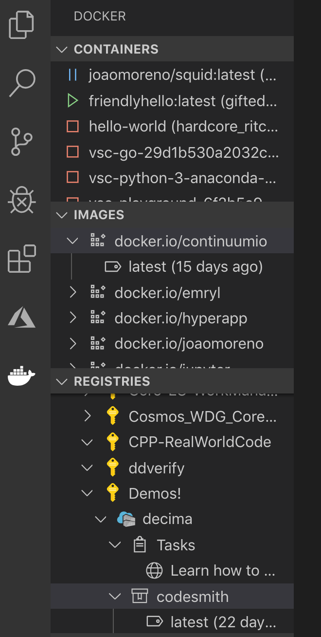
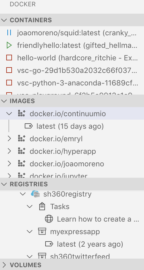
VS Code is updating its icons to use an outline style. With this change coming to stable soon (should be released tomorrow), I've gone through and updated all of the icons used in the Docker extension to match this new style.
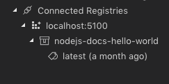
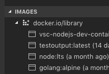
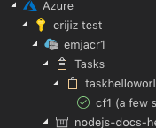
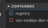
Below is a summary of the changes and a sample, I didn't touch any of the registry/azure icons as those respect those brand's icons:
cc @chrisdias @fiveisprime