ActionSet overflow flyout (... actions menu) #4715
Description
Description
Card authors need a way to provide additional actions to user that doesn't compromise the user experience when limited space is available. Many host apps limit the number of actions in a card, e.g., Teams allows a maximum of 6. This has limitations in the form that not all actions can be sufficiently addressed within a card (when there are more than 6) and even in the case of 6 options it provides a clunky and dense experience for the user.
As a workaround some developers are end up with a situation where they are forced to hide options under a "more" button, which triggers another card to be sent by the bot (which is not ideal), creating a convoluted workflow.
An ActionSet overflow (…) flyout would allow card authors to include additional options that do not make it onto the card. Functionally these are no different from actions from Buttons on the card, but visually they are hidden under the overflow menu.

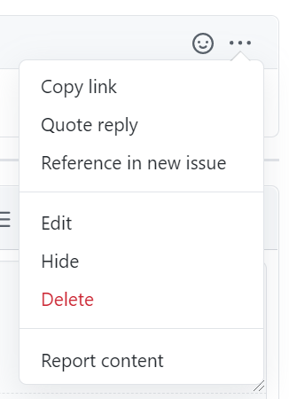
The behavior would be very similar to what you see in GitHub issue comments. There is a single "primary" button to react to the comment, and a handful of secondary actions that are available when the ... is pressed.
Open Issues
- What should the rendering behavior be for actions that are stacked vertically? (Decision: allow the host to specify the overflow text)
- Should the overflow menu title be configurable? By Card Authors and/or Host? E.g., instead of
...it says "More". Obviously we get into localization then (Decision: Host controlled) - Consider different word for "mode", e.g., "priority"
- Should the host be able to configure the orientation of the ..., or built into the renderers? E.g., vertically on Android but horizontal on iOS
- ShowCard UX considerations (David has full details) - From David: "When a ShowCard action is clicked from the overflow menu, it is moved back to the row of buttons and replaces the last visible one [...] The bottom line is that without thus behavior, things feel wrong and provide a poor UX"
- How many actions will overflow into the menu?
Requirements
- All
Action's get a new property to designate their importance: either primary or secondary. - If any secondary actions exist, the renderer will create an "overflow" button at the end of the action bar
- The overflow button's
titlewill default to "..." - When clicked, a "flyout" menu will open that renders all the secondary actions in a vertical list
- Clicking one of the secondary actions behaves the same as any other Action, and the flyout is closed.
- Tapping/clicking outside of the flyout must dismiss it
- All the primary actions get rendered first, regardless of the order they are put in the array.
- Automatic overflow due to Host constraints: when the card author specifies more primary actions than are allowed in Host Config, we should automatically overflow them into the secondary menu instead of dropping them (as is the current behavior). The overflow menu button is an additional button after the maxActions are displayed (for a total of maxActions + 1 buttons). Note: Current JavaScript implementation has this off by default for backcompat reasons, configurable by global variable.
- The secondary actions (menu items) need to support
icons (cut) andtitle - Need to work through the extensibility and native styling for the
...button as well as the individual secondary items. - [P2] Automatic overflow due to visual constraints (e.g., screen is too narrow). This work can be done if it's easy enough and doesn't have a strong render latency due to double-pass needs
Accessibility
- If the flyout is open, the ESC key should also dismiss it
- Need some way to specify the aria-label for the auto-generated ... button (which needs to be localized)
- The flyout menu must be keyboard navigable
- The flyout must be properly designated as a "popup" to screen readers
Schema
| Property | Type | Required | Description |
|---|---|---|---|
mode |
Enum (Primary, Secondary) | No | Whether or not the Action is a primary or secondary Action. Secondary actions will be collapsed into an overflow menu |
Examples
ActionSet example
In this example all the actions are marked as secondary, so a single overflow button would be rendered on the card, and the individual actions would be available when the flyout was activated

{
	"type": "ActionSet",
	"actions": [
		{
			"type": "Action.Submit",
			"title": "View",
			"mode": "secondary"
		},
		{
			"type": "Action.Submit",
			"title": "Edit",
			"mode": "secondary"
		},
		{
			"type": "Action.Submit",
			"title": "Delete",
			"mode": "secondary"
		}
	]
}
actions example
In this example, there are two "primary" actions (which is the default), and one secondary action. This creates a ... overflow actions after all of the primary actions, exposing "Delete" when the flyout is activated.

{
   "type": "AdaptiveCard",
   "actions": [
        {
            "type": "Action.Submit",
            "title": "Set due date"
        },
        {
            "type": "Action.OpenUrl",
            "title": "View",
            "url": "https://adaptivecards.io"
        },
        {
            "type": "Action.Submit",
            "title": "Delete",
            "mode": "secondary"
        }
    ]
}