DXC Toggle Group improvements #273
Description
Is your feature request related to a problem? Please describe.
In toggle groups, when the toggle option is of type icon, there are couple of issues
- Icons are not always self-explanatory. Need capability to show text with icons so that business users may identify better. Image below contains different insurance types shown as icon toggle. It is very difficult for a business user to understand which icon corresponds to which insurance. Hover text or text next to icon would be better
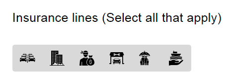
- toggles should be allowed to have spacing in between in case of icons. Otherwise, they give the feel that it is a single image(refer to above image)
Describe the solution you'd like
Problem and proposal described above
Describe alternatives you've considered
Tried using a custom component during design, which was not approved by CDK team as it was not valid use case
Additional context
Add any other context or screenshots about the feature request here.
Add Labels
dxc-toggle