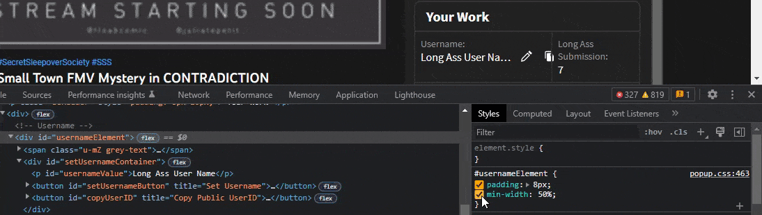
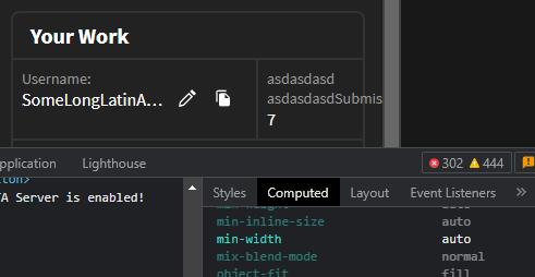
"min-width: 50%" may cause #usernameElement to shrink #1429
Description
With the Russian translation, for example, the #sponsorTimesContributionsContainer>p.u-mZ.grey-text has a long content, and #sponsorTimesContributionsContainer is squishing #usernameElement together, even though there is a lot of empty space wasted.
This leads to undesired overflow that may leave the button(s) unclickable.
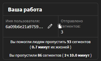
Weirdly, the min-width on #usernameElement seems to make it shrink as soon as the #sponsorTimesContributionsContainer becomes too wide, whereas not setting it will have it fall back to auto, which results in a better distribution of space among the elements, leaving #usernameElement bigger.
This would solve the above issue.
Who would have guessed that setting a minimum width would result in something shrinking? 😅 Not I!
However, I don't know if this is the best solution and I can't test it in different environments right now, so I'm writing this up as an issue rather than creating a PR.
Maybe setting a max-width of 90px for the #sponsorTimesContributionsContainer>p.u-mZ.grey-text element would be preferred, seeing as we're already using a pixel-based max-width on the left side?