Layout: Implement column defaults based on screen size #906
Description
Detailed description
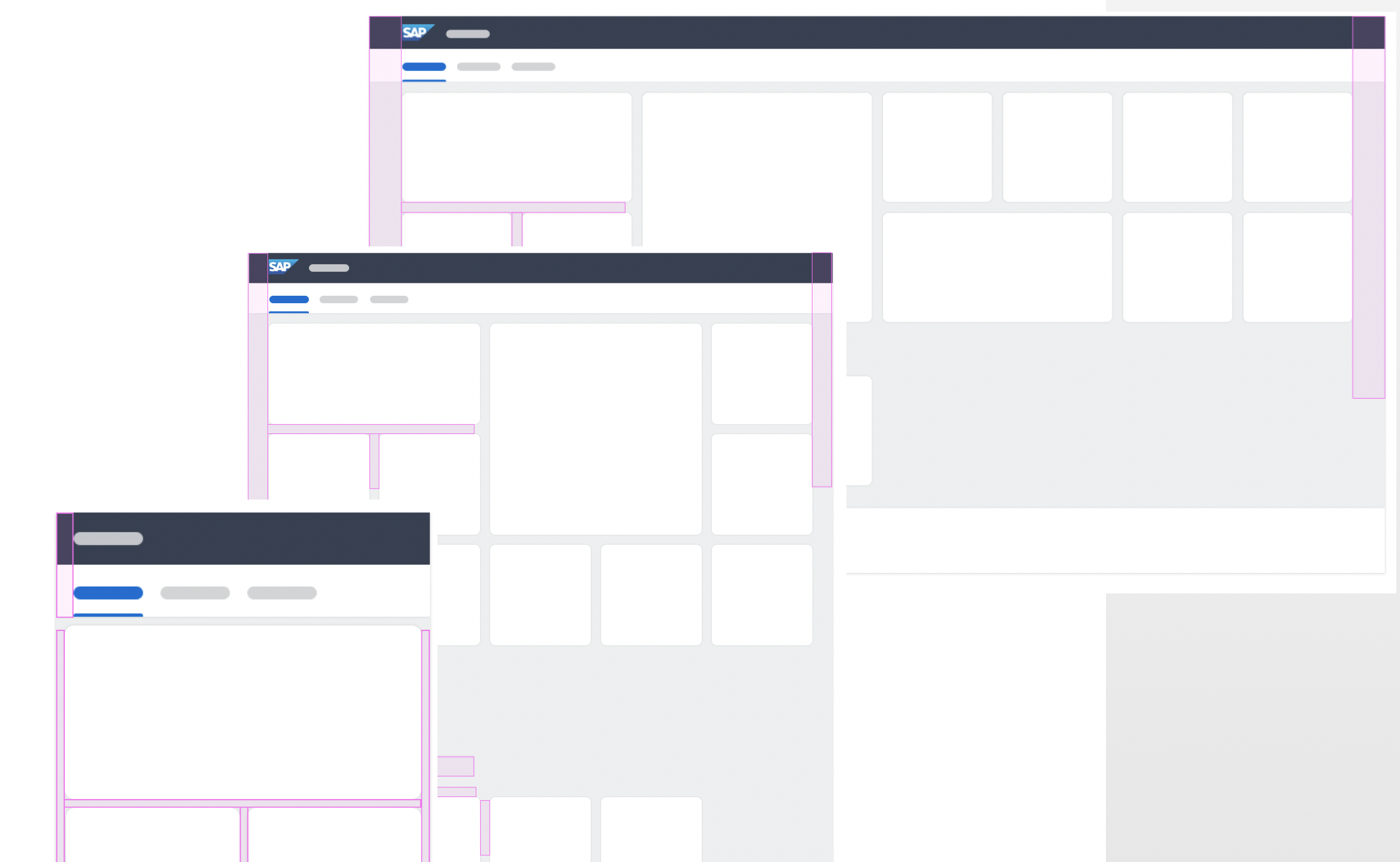
The default column number should adjust based the screen size.

The value of this approach is that span classes can be consistent across screen sizes. For example, the following would result in three stacked cols on a phone, two side-by-side and one under on tablet, and three side-by-side on desktop.
<div class="fd-container">
    <div class="fd-col--4">col</div>
    <div class="fd-col--4">col</div>
    <div class="fd-col--4">col</div>
</div>
This is more logical than forcing the spans with media queries or requiring addt'l classes like fd-sm-col--12 fd-md-col--6 fd-col--4.
- Use case
This grid will be very important for card layouts where the size will determine the number of cards displayed with more content fitting at large sizes.
- Expected behavior
Nested grids should have the same behavior.
- Examples for reference
Additional information
- Screenshots or code
- Notes
Must decide if we want to break the existing col or implement a new class such as column.