Add minimal type panels #117
Conversation
 ang-zeyu
changed the title
ang-zeyu
changed the title
|
Quick comment: try to make the extra decorations subtle (less eye-catching) as much as possible, especially when the panel is expanded. They should not disrupt the visual flow of the page contents. |
|
Noted, thanks for the suggestions! |
Can |
Good idea, hadn't thought of using mixins. Will try this out. Thanks! |
ang-zeyu
force-pushed
the
minimal-panel
branch
from
ad3ac03 to
33ba4df
Compare
There was a problem hiding this comment.
Good work with the refactoring. I have no comments about the minimal panel implementation currently, I am OK with accepting this current version. So additional stuff to take note:
- Please add
src/panels/PanelSwitch.vueandsrc/panels/PanelBase.jsto.eslintignore. - Also remember to open another PR in MarkBind to mention about this feature in the documentation.
|
Thanks for looking through it again! Will be tweaking and testing it a little more, and making those changes. |
ang-zeyu
force-pushed
the
minimal-panel
branch
2 times, most recently
from
e5fab07 to
c0b3136
Compare
ang-zeyu
force-pushed
the
minimal-panel
branch
from
c0b3136 to
bfab2c5
Compare
|
Made just one extra style change ( the vaguely visible vertical line that appears when you hover over the header ), and cleaned up the refactor in general. Should be ready for review |
|
EDIT: Ignore this post, I made a mistake in pulling the branch... |
What is the purpose of this pull request? (put "X" next to an item, remove the rest)
• [x] Enhancement to an existing feature
Implements MarkBind/markbind#564
Corresponding documentation PR: MarkBind/markbind#960
What is the rationale for this request?
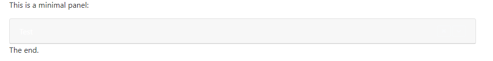
To add minimal ( super-seamless ) type panels, which better conveys that the panel's content is 'optional'
What changes did you make? (Give an overview)
A new
type="minimal"value was added to the existingtypeattribute in the<panel>component,which allows creating a minimal type panel.
If no header is specified, a
...icon is automatically used. If one is specified, then a down caret icon will be appended to the header, unless theno-switchattribute is specified.While expanded, the footer completely disappears from view unless the mouse is hovered over the content or the footer itself. In mobile view, it has a small opacity so that the reader knows that the footer is present.
Provide some example code that this change will affect:
Is there anything you'd like reviewers to focus on?
The design of the minimal panels in general
Testing instructions:
I added a sample usage of minimal type panels to
src\template\default\index.md. All the attributes specified in the user guide ( https://markbind.org/userGuide/usingComponents.html#panels ) should produce the expected behaviour, including the usage of customslotheaders.The appropriate icons should also fade in and out when hovered over, as displayed in the above
gif.Proposed commit message: (wrap lines at 72 characters)
Added minimal type panels